TYPOGRAPHY- FINAL PROJECT
22nd November 2017- 12th December 2017 (Week 12-13)


Tulekova Arailym (0326122)
Typography and Hypertextuality
Typography and Hypertextuality
Final Projects
LECTURES
Lecture 12
22nd of November 2017( Week 12)
Line spase or leadeng reffers to the space beetween two two linwes in the text. But there some argues about the defenition of this termins. In Mr. Vinod's opinion leading refers to the space between the descender line and the ascender line in two rows of text, whereas line spacing refers to the space taken up by a line of text from its descender line to the ascender line of the previous row. A comfortable leading is 3 points larger than the text size.
Paragraphs are often marked off by an indentation at its beginning, but make sure that the body of text is justified so that it will look less ragged. Don't use paragraph spacing and indentations simultaneously. Also, when typesetting long bodies of text, we have to be mindful of the way we present information- by using hierarchy to show the different levels of importance.
INSTRUCTION
FINAL PROJECT
Week 12
Visual references:

Fig1.1 Visual Reference

Fig1.2 Visual Reference

Fig1.3 Visual Reference

Fig1.4 Visual Reference
Drafts:

Fig2.1 Draft

Fig2.2 Draft
Week 13
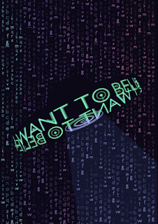
Final outcome:

Fig.3.1 Final poster

Fig 3.2 Gif Animation
FEEDBACK:
Week 12: In This class I tryed to design my poster. I showed two of my drafts above to Mr. Shamsul and he said tham my font size should be bigger because it's not visible on the first one. What about the second draft, he said it's too deisignet and not appropriate to exercise.
Specific feedback: The Reflection part is the most important part of the blog, so make sure it evaluated enough. True type format screen should be in landscape. Make the frames more thin.
Week 13:
I showed the finale outcome to the Mr. Vinod and he said it's okay as well as animated gif. I tryed to print it out, but the image which came out was too dark, so Lecturers said to reprint it to make it look more similar to original.
REFLECTION:
Experience: I was trying to find a posters with typefaces that will be at least a bit look like my font, but most of the fonts are bolder than mine and their designs was not suitable for my thin font, so i continued searching postrs with better arrangment whether meaning.
Observation: I like putting too many details in my works, but the evaluation could be too overlapping and busy, which will mess up all the work, so I was holding myself from putting further dtails in work.
Findings: I found out that that the "beauty in simplicity" and sometimes it useful to focul all your efford on one thing to make it better.
Comments
Post a Comment